| Author |
Message |
| Registered: March 13, 2007 | Reputation:  |  Posts: 5,481 Posts: 5,481 |
| | Posted: | | | | I keep finding lately that when I submit what I think is a better color composition, it gets voted against saying that the existing is better or my colors are not as true as original etc etc.. Here is side by side comparison. Is my monitor ( which I believe gives great color and resolution ) really this much out of whack? Notice the extra reds and greens in the face tones on the left,, But I will say the Main title is better in Red than blood red (right..) But the face tones.. Come on now.. Can I get any other reviews here?? 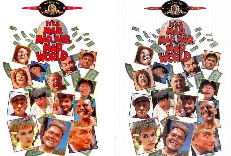 | | | In the 60's, People took Acid to make the world Weird. Now the World is weird and People take Prozac to make it Normal.
Terry |
|
| Registered: March 14, 2007 | | Reputation: |  Posts: 950 Posts: 950 |
| | Posted: | | | | I don't own this, so can't vote, but to me, the one on the right looks better (you're right about the title, though). There is a lot less red in the faces. However, not to be devil's advocate here, everyone's monitor is set up differently, so it make look great on yours and mine, but others it looks worse... | | | | Lori |
|
| Registered: March 13, 2007 | | Posts: 793 |
| | Posted: | | | | The overall look and colors seem better to be on the image on the right, but the reds are too dark, and I see a gray grid in the white. So I'd vote neutral on that. Face colors are better, but overall, it doesn't improve the image because it introduces problems that weren't present.
But each monitor is different. I know, for example, that my monitor here at work totally sucks at dark tones. They all blend together to black. So I never vote on images while I'm at work. |
|
| Registered: March 13, 2007 |  Posts: 465 Posts: 465 |
| | Posted: | | | | Quoting RossRoy: Quote:
..., and I see a gray grid in the white. Me, too, and it looks terrible. I would never vote "Yes" for that scan. | | | | Michael |
|
| Registered: March 13, 2007 | | Reputation: | | Posts: 5,481 |
| | Posted: | | | | I see grey grid too..,. LOL
But you know where I got this cover from? Not from me.. But from the 'Other' release in the data base. There are only three ., and two are the same and this one one on the right is the other..
I should flip this around and download the other title to my wish list and then 'flip' that cover too, ,and I can guarantee it will get no votes too ... You can't win on Invelos. There is bad data all over and no matter how hard you try and correct it will still remain.. Thank goodness we have a Lock feature. | | | In the 60's, People took Acid to make the world Weird. Now the World is weird and People take Prozac to make it Normal.
Terry | | | | Last edited: by widescreenforever |
|
| Registered: March 14, 2007 | | Posts: 742 |
| | Posted: | | | | While I don't think the scan on the left is anywhere near "ok" (way too red, way too much contrast) (do I hear anyone say "Pantone"  ), the scan on the right is far worse. While the face colors are a significant improvement, everything else about that scan is worse than the right side one, starting with the reds now being way too dark (talk about substituting one screw up with its diametral equal), continuing with the faded look of the MGM logo and climaxing with the grid in the white area. A perfect example for lack of "significant improvement", rather the exact opposite of improvement. To address your original question: if the scan on the right looks significantly better on your monitor than the one on the left, you should definitely consider a re-calibration  | | | | Lutz |
|
| Registered: March 13, 2007 | | Reputation: | | Posts: 6,635 |
| | Posted: | | | | There are two problems when it comes to the way people vote on images:
1. They do not actually look at the original image when comparing which of the two is better. They simply pick the one they "feel" is better by comparing the two screen images, whether it is really a truer representation of the actual DVD cover or not.
2. There is a very distinct preference for the following image attributes (again without regard to the actual DVD cover):
a) Over-saturated colors (people don;' like the "washed out" look)
b) Contrast cranked way up (people don't like the "gray-look")
c) Sharpness way over-done making the image look grainy (people don't like the "soft-look")
All of these "image corrections" are performed without regard to the original DVD cover image quality. If XXX (enter whatever photo enhancement software you wish here) can "improve" the image, then by all means let it do so.
Then of course there are the contributors who MUST submit images for every profile contributed regardless of whether they are significantly better or not. These folks just have to see their name in there when they "view contributors".
If you compare the two images on the screen against the actual DVD cover instead of against each other, it is hard to get it wrong. | | | | Hal |
|
| Registered: May 19, 2007 | | Reputation: | | Posts: 585 |
| | Posted: | | | | This is kind of interesting because the scan on the right looks far better than the one on the left. I see no "grey grid" on either, the backgrounds are both white. The one of the left is far too red and the one on the right has a more natural skin tone.
I don't own this DVD so I can't compare the scanned cover to the actual one (which is how I generally vote), but just by comparison I would definitely vote Yes to the one on the right.
I wonder if the difference is between CRT users and LCD users. I'm using a Dell 2407WFP (24in Widescreen LCD) monitor. I'd be curious if the people who see a grid artifact are using CRT or LCDs and maybe even what color depth and resolution they're running (1920x1200 32bit here).
I even took the screenshot in the original post and copy/pasted it into Photoshop and blew it up 500% and I see a solid white background with no grid. | | | "Rules are for the obedience of fools and the guidance of wise men" - Douglas Bader
"A common mistake that people make when trying to design something completely foolproof is to underestimate the ingenuity of complete fools." - Douglas Adams |
|
| Registered: March 13, 2007 | | Reputation: | | Posts: 2,394 |
| | Posted: | | | | @Vega,
I see the grid on my 22in wide-screen LCD monitor (1680x1050) so I'd say it isn't a CRT/LCD thing at all. | | | Another Ken (not Ken Cole)
Badges? We ain't got no badges. We don't need no badges. I don't have to show you any stinking badges.
DVD Profiler user since June 15, 2001 |
|
| Registered: March 13, 2007 | | Posts: 4,594 |
| | Posted: | | | | I own this title and the scan on the left is much closer to the actual colors on the cover. They are just a hair oversaturated. The scans on the right are way too desaturated...not even close to actual cover and there is moire patterning throughout the image...especially visible in the white background. | | | | My WebGenDVD online Collection |
|
| Registered: May 19, 2007 | | Reputation: | | Posts: 585 |
| | Posted: | | | | This gets more interesting. My monitor has various "pre-set" modes that I can use. Since mostly I use it for gaming I generally leave it set for "Gaming Mode". The other modes available are "Multimedia" and "Desktop". In both Gaming and Multimedia modes it does some kind of color/sharpness/image correction on anything displayed so that it looks perfect. However, when I flip it to "Desktop" mode now I can see the "grey grid" you guys are mentioning. Though, not so much of a grid as just grey vertical stripes visible in the background. I don't see any horizontal stripes that would make it a grid pattern.
The reds on the left scan are still a little too high, but not quite as bad as they were before. Except for the grey stripes, I'd probably still vote for the one on the right as far as colors go. But without having the DVD in my hand it's hard to say. | | | "Rules are for the obedience of fools and the guidance of wise men" - Douglas Bader
"A common mistake that people make when trying to design something completely foolproof is to underestimate the ingenuity of complete fools." - Douglas Adams |
|
| Registered: March 14, 2007 | | Reputation: | | Posts: 950 |
| | Posted: | | | | Huh, I don't see the grid in the white either. To me, like I said, the reds are very dull, but the flesh tones are very good. I'm on a LCD, too, though that doesn't seem to matter.
Just played with my monitor. I have my contrast pretty high, and when I lower it, I get the grey lines in the one on the right. | | | | Lori |
|
| Registered: March 13, 2007 | | Posts: 793 |
| | Posted: | | | | I think that those of you who don't see the grid, might have the brightness set too high, which would washout the gray and make it white. Same for those Gaming/Desktop/Multimedia settings.. I don't see any reason for that.. Why boost the contrast and brightness just because you are gaming?  |
|
| Registered: March 14, 2007 | | Reputation: | | Posts: 950 |
| | Posted: | | | | Mine's up high (the contrast) for two reasons. The first is I play a couple games that are very dark and unless the contrast is high, I can't see things in the corners. The second is one of the users of the computer is virtually blind and the higher contrast makes it easier for him to see writing. | | | | Lori |
|
| Registered: March 13, 2007 | | Posts: 21,610 |
| | Posted: | | | | Quoting widescreenforever: Quote:
I keep finding lately that when I submit what I think is a better color composition, it gets voted against saying that the existing is better or my colors are not as true as original etc etc.. Here is side by side comparison. Is my monitor ( which I believe gives great color and resolution ) really this much out of whack? Notice the extra reds and greens in the face tones on the left,, But I will say the Main title is better in Red than blood red (right..) But the face tones.. Come on now.. Can I get any other reviews here??
Yes it is, Terry. Not even close. Skip | | | ASSUME NOTHING!!!!!!
CBE, MBE, MoA and proud of it.
Outta here
Billy Video |
|
| Registered: May 8, 2007 | | Posts: 823 |
| | Posted: | | | | Quoting hal9g: Quote:
2. There is a very distinct preference for the following image attributes (again without regard to the actual DVD cover):
a) Over-saturated colors (people don;' like the "washed out" look)
b) Contrast cranked way up (people don't like the "gray-look")
c) Sharpness way over-done making the image look grainy (people don't like the "soft-look") I noticed that too. People seem to just love over saturation and high contrast. I find it disturbing! Skip seems to prefer images like this as well, as evidenced by his past voting and his comment above. | | | | 99.9% of all cat plans consist only of "Step 1." |
|