| Author |
Message |
| Registered: March 13, 2007 | Reputation:  |  Posts: 5,635 Posts: 5,635 |
| | Posted: | | | | I really like this. I really dislike this. Bring back charts with drop down menus, please. And please drop the reference on the right, too. | | | If it wasn't for bad taste, I wouldn't have no taste at all.
Cliff |
|
| Registered: March 13, 2007 | Reputation:  |  Posts: 5,504 Posts: 5,504 |
| | Posted: | | | | I'll second that,, I like the ol' IVS chart/graphs too.. | | | In the 60's, People took Acid to make the world Weird. Now the World is weird and People take Prozac to make it Normal.
Terry |
|
| Registered: March 21, 2007 | | Posts: 76 |
| | Posted: | | | | Maybe I don't see it but what is it you don't like about them... I don't see a whole lot of difference...
elaborate? | | | _________________________________________________________________________
"Crush your enemies, see them driven before you and hear the lamentation of the women!" |
|
| Registered: March 13, 2007 | Reputation:  |  Posts: 5,635 Posts: 5,635 |
| | Posted: | | | | Quoting m666: Quote:
Maybe I don't see it but what is it you don't like about them... I don't see a whole lot of difference...
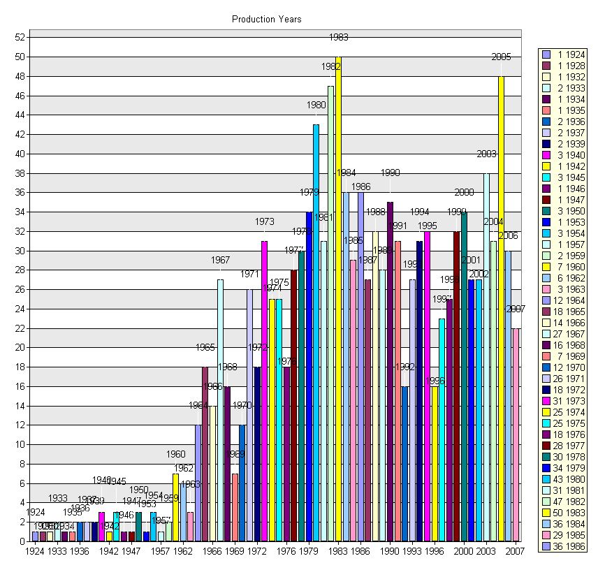
elaborate? Did you open both? Notice on the one I like (2.5) that the years 1889 to 2007 go nearly full width on the screen, allowing air between them, and the dates below are easy to follow. They also have the count by year at the top of each column, again very easy to read. On the other hand, on the one I do not like (3.0), the chart is not full width, but has a menu on the left (which was a pull-down menu on 2.5), and a key on the right, which only goes from 1889 through 1943, leaving 1944 through 2007 out. The dates below each bar are horizontal, rather than vertical, making it harder to figure out which column is for what year. At the top of each column is the year again: both useless and impossible to read. So I have to use the code on the right to determine the actual count of each year, but I'm missing 54 years. 2.5 is a useful chart. 3.0 is not. | | | If it wasn't for bad taste, I wouldn't have no taste at all.
Cliff |
|
| Registered: March 19, 2007 |  Posts: 93 Posts: 93 |
| | Posted: | | | | In my opinion the charts are ok. What i miss is the kind of statistics used under the Mithirandir's Skin. Yesterday i was wondering if that kinda of information could be available on the welcome menu. Just basic info like the 10 most collectable actors and directors, or the longest movie in collection or what so ever information. Well is just a thougth. PS: I know there is a updated version of Mithirandir's Skin for DVDProfiler 3.  | | | | Beauty is in the eye of the beholder! |
|
| Registered: March 13, 2007 | Reputation:  |  Posts: 1,135 Posts: 1,135 |
| | Posted: | | | | The graphs in 3.0 no longer have any gridlines in the background to visually assist measuring the bar numbers. The charts may have gotten a lot flashier, but are less useful. Some of the displays we can specify are not very useful or muddled beyond comprehension when objects and labels overlap. The feature needs to be fully lab-tested a bit more when the next version rolls out, as I think some obvious glitches were missed. An examination of the 2.x charts/graphs will show that sometimes simpler is better. Rather than having a wide choice of display methods, I would prefer more choice in the area of data selection. But overall, I'm still impressed with it all. |
|
| Registered: March 13, 2007 | Reputation:  |  Posts: 1,135 Posts: 1,135 |
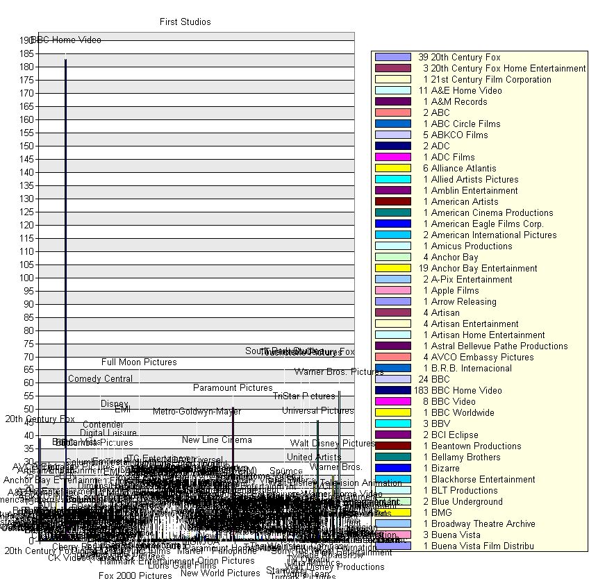
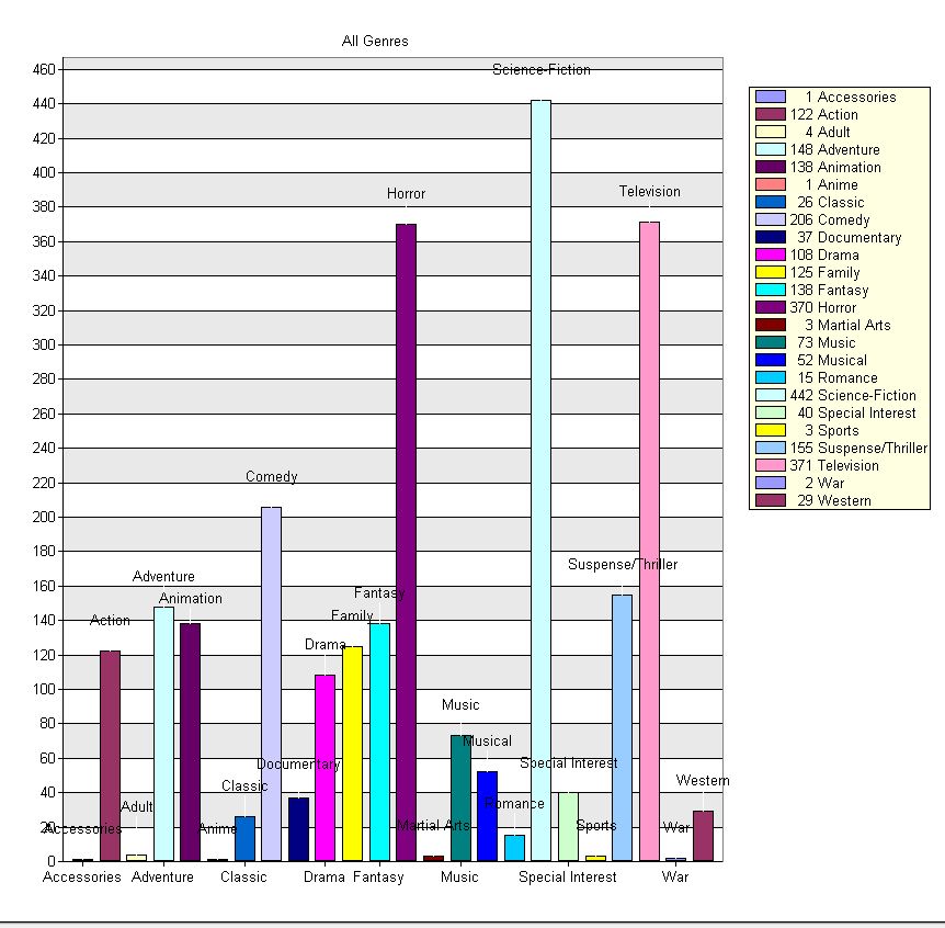
| | Posted: | | | | Hi. Charts & Graphs are still very unpleasant; I'm wondering if they can be cleaned up in the next version? Example: Studio displays are graphically messy and unusable due to a clutter of labels:  Even Genres have label text which are laid over the bars:  It is sometimes hard to see the exact measurement of each bar. If a numerical label could be hovered over each bar, it would be appreciated. I would also welcome a toggle to turn labels on or off. The Key area on the right side also does not display the full data range if the list is beyond a certain length. In the example below, the key area expires at 1986.  | | | | Last edited: by Doombear |
|
| Registered: August 22, 2007 | Reputation:  | | Posts: 1,807 |
| | Posted: | | | | Quoting Doombear: Quote:
Hi. Charts & Graphs are still very unpleasant; True. As a side note, I'd like (as an option) to be able to group related Studios in one label and one bar. For instance all "BBC" studios (BBC, BBC Home Video, BBC Video, BBC Worldwide). | | | | -- Enry |
|
| Registered: March 13, 2007 | Reputation:  |  Posts: 770 Posts: 770 |
| | Posted: | | | | Quoting Doombear: Quote:
Hi. Charts & Graphs are still very unpleasant; I'm wondering if they can be cleaned up in the next version?
Example: Studio displays are graphically messy and unusable due to a clutter of labels:
It is sometimes hard to see the exact measurement of each bar. If a numerical label could be hovered over each bar, it would be appreciated. I would also welcome a toggle to turn labels on or off. Or maybe a horizontal scrollbar? |
|